
Developed a timeless, emblem-style logo for The Farm Store, blending rustic charm with modern aesthetics to reflect its commitment to fresh, organic, and locally sourced produce.
The Farm Store
Visual Identity
February 26, 2024
The primary aim of this project was to create a distinctive and visually compelling brand identity for The Farm Store, a business dedicated to providing fresh, high-quality farm produce. The brand required a logo that would serve as the foundation for its visual identity while maintaining versatility across various platforms and marketing materials. The project was designed to develop a strong, recognisable logo that would convey the brand’s commitment to fresh, organic, and locally sourced products.
A key aspect of the project was ensuring that the logo worked effectively across diverse applications, including vehicle wraps, eco-friendly shopping bags, and promotional posters. The design needed to be aesthetically appealing and practical, allowing for easy reproduction on different surfaces without losing clarity or impact. From concept development to final execution, the project involved extensive research into industry trends, customer expectations, and visual elements that best represent organic farming and fresh produce. The end result was a logo that embodies the essence of The Farm Store and establishes a strong, trustworthy presence in the market.
The design process was guided by a series of objectives to ensure that the final logo aligned with the brand’s identity and market positioning. One objective was to create a logo that accurately reflects The Farm Store’s core values of freshness, sustainability, and authenticity. This involved incorporating natural elements such as farmland, greenery, and organic shapes to evoke a sense of nature and wholesomeness.
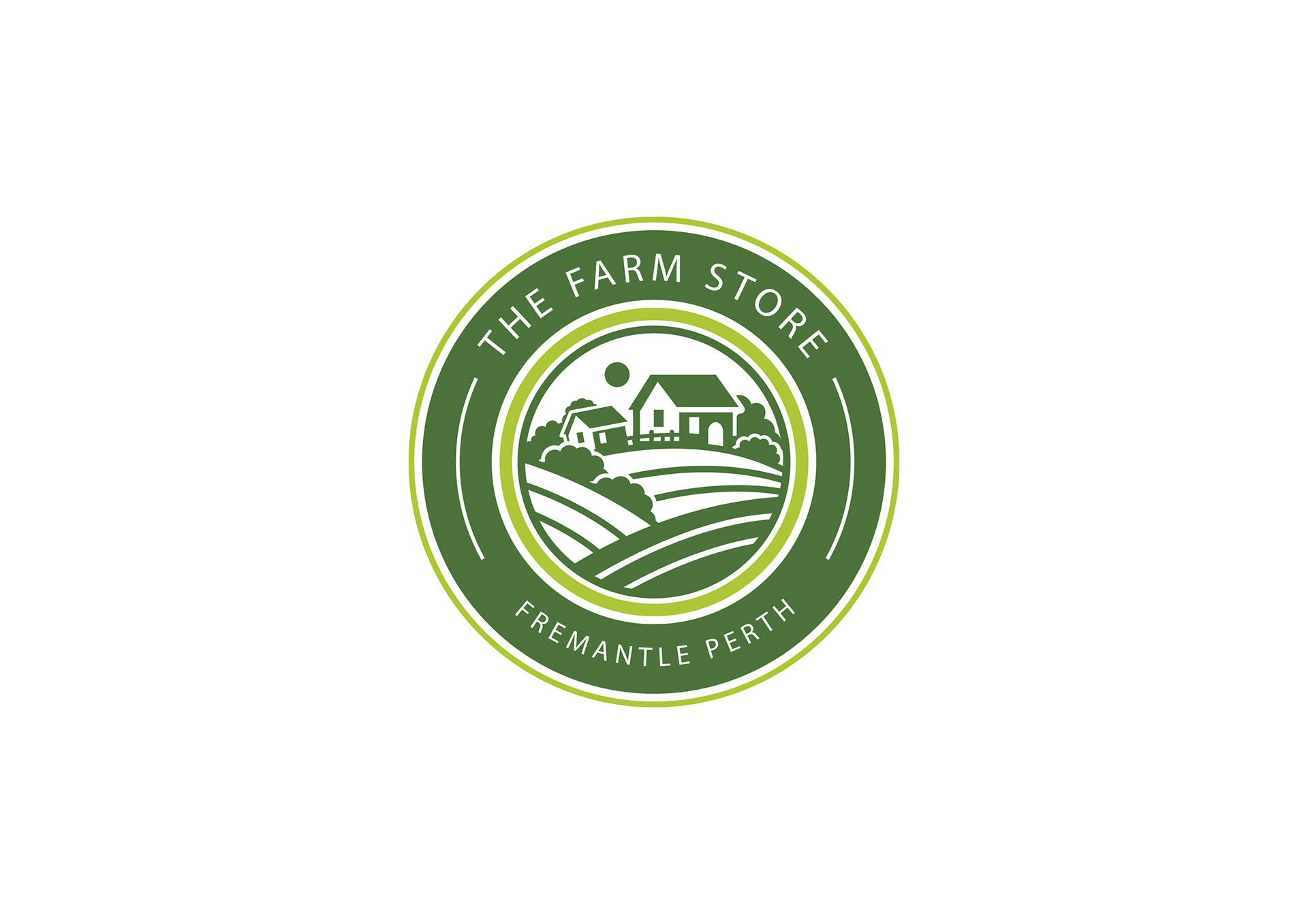
Another key objective was to strike a balance between modern aesthetics and timeless appeal. The logo needed to be contemporary enough to attract new customers while maintaining a classic, rustic charm that resonates with those who appreciate traditional farming and organic produce. A circular badge-style design was chosen to convey a sense of trust and heritage while remaining sleek and professional.
Versatility was also a crucial consideration in the design process. The logo had to work seamlessly across a range of branding materials, including signage, packaging, digital platforms, and promotional items. By maintaining a clean and well-structured design, the logo ensured high readability and adaptability, regardless of size or format. Additionally, simplicity and impact were central to the approach, as an overly complex design could compromise brand recognition. Careful attention was given to selecting typography, iconography, and colour schemes that combined to create a bold yet refined visual identity.
The main challenge in this project was to create a logo that could effectively represent the brand’s mission and values while remaining visually appealing across various applications. Given that The Farm Store focuses on fresh produce and sustainability, it was essential that the design communicated these elements in an instantly recognisable manner.
One significant hurdle was incorporating multiple brand attributes—freshness, authenticity, trust, and modernity—into a single, cohesive design. There was a fine line between a design that was too intricate, potentially diluting its impact, and one that was oversimplified, thereby failing to capture the business’s essence.
To overcome this challenge, extensive research was undertaken into the visual language of organic markets, farm stores, and sustainable brands. The design process involved numerous sketches and iterations, exploring different layouts, typography options, and colour palettes until the ideal combination was achieved. The final solution was a circular emblem-style logo featuring a stylised farm landscape with rolling fields and a farmhouse, encircled by a double-ring border incorporating the business name. This approach successfully conveyed a strong sense of agriculture, nature, and community while maintaining a polished, professional appearance. The use of deep green tones reinforced the association with organic farming and environmental sustainability, and the structured composition ensured clarity and balance.
The completed logo now serves as a cornerstone for The Farm Store’s branding, effectively communicating its commitment to fresh, high-quality produce and sustainable farming practices. The design exudes professionalism and authenticity, making it a powerful tool for brand recognition and customer engagement.
When applied across various branding materials, the logo maintains its impact and clarity. On eco-friendly shopping bags, it reinforces the business’s sustainability efforts and serves as an elegant promotional item. On vehicle wraps, it transforms delivery vehicles into mobile advertisements, thereby increasing brand visibility and attracting new customers. In posters and digital promotions, the logo stands out, creating a cohesive and compelling brand presence across all platforms.
Overall, the project achieved its aim of creating a versatile and impactful logo that enhances The Farm Store’s branding efforts. Through careful research, iterative design refinement, and strategic execution, the final logo not only appeals visually but also encapsulates the brand’s values and mission, ensuring long-term success in a competitive market.


© 2025 M Design Sydney. All Rights Reserved.